Friday 11 December 2009
Marvin's Evaluation
In what ways does your media product use, develop or challenge forms and conventions of real media products?
1.We feel that our video challenged the regular conventions of a typical indie video as we originally took our idea from lily Allen’s video LDN where it demonstrates a very clear contrast between typical London life and a rose tinted version that shows it as much nicer. We feel that we have created something similar with our video with the trigger for the changes to be this nerdy boy and a hat.
We spoke about a few other ideas before we agreed on the final one but we found flaws and issues with them. We thought the idea we chose was primarily achievable and represented a good visual style with a lot of scope for some adaption.
The way that we have challenged others in this genre is by going with a lighter sided view of life and added some comedy in there also which I feel goes with the type of video we created. In a lot of indie videos you don’t see as much of the artist as you do in our video but we feel it works well because he is telling a story throughout
Also in the digipak we didn’t go with the conventional style of the genre. You can see this as we used bright colours and had smiling shots of the artist in a jokey fashion.
We spent a lot of time researching the genre and products from the genre in order to be prepared before we started our project so that none of our shots or images or anything looked really out of place or unplanned.
We used a mix of generic conventions with our own visual style
How effective is the combination of your main product and ancillary texts?
2.We feel that our video fitted well with our poster and digipak as they all featured the artist heavily. For instance lots of close up shots that are head on except on the poster as we thought that as this is likely to be the first thing released that we should have some mystery to the artist. But we used the same fonts that we feel are bold and yet give the artist a fun image by using bright colours on the font
We kept something in all of our products that binds them all together the hat that I also think is very appropriate to the genre and the image that we are portraying for the artist.
Also by keeping the continuity throughout all the products we are giving a clear visual style to the audience and we feel we have appealed well to the target audience by using typical genre images in some parts.
In the music video we played a lot on the character he was the main focus in all of the tasks we wanted to show his personality and characteristics. We also wanted to show that the band had a fun image that fits with the genre.
We showed this by making our character portray a nerdy kid isn’t very popular or cool. I think this adds to the humour of the band that fits with the genre and the image we were trying to create for the character and the band. Also we used the usual image for the band by using the sort of clothes you would generally expect from the indie genre. For instance the shirt and generally trendy clothes. Also I feel that one of the best things that we use throughout the project is the props. Because by using the hat we have created a visual symbol for the band and character. Which we made sure features in all of our products as we think its something that features in a lot of indie bands and artists. Other props we used were a guitar for the cool kid compared to the ‘guitar hero’ guitar of the nerdy kid to get a subtle contrast which we thought worked well. We considered using the guitar in the digipak but then we revised our ideas and said that it didn’t feature enough in the video compared to the hat also we saw the hat as a switch so when the nerdy kid puts it on he becomes everything he wants to be. We also did comparisons between the car and the moped and the fan mail and the bill. So I think we used props well throughout and it made the contrast effect we were looking for more achievable. In the digigpak we utilised a shot face on with our artist but we caught him off guard we didn’t want him posing for it as we wanted to make our artist look friendly and everything from the project is not on for show as if its just footage and images from normal life for him and we did that in the poster as well. The artist is looking the other way also so it gives a sense of mystery as well which we wanted as it would be some people’s first sight of the artist. But overall we think that there is a clear correlation between all products and the artist comes across as friendly, fun and approachable.
What have you learnt from your audience feedback?
3.Overall we thought we got good helpful feedback throughout the entire project. We got helpful suggestions such as ‘use more lip syncing’ and ‘use more locations’ so we went and reviewed the footage and comments and decided to act upon these things which we feel has made our product better.
But there were times where we thought the feedback we received was not up to scratch. Such as when peers were reviewing our rough cut one person mentioned we used a lot of lip syncing and at the time we had barely used any. Also someone mentioned that the hat used is irrelevant but then we explained how its part of the artist’s visual style and a signature item from the artist. We also received some verbal feedback regarding other products. Regarding the digipak we received some comments from peers about the institutionalisation that we needed to include such as a record company logo and parental advisory and various others. As for the poster we had some peers saying how we should include some quotes and reviews that would make our product look more official and professional.
We also created feedback from our own group by holding regular production meetings involving everyone from the group
Overall as a group we found the feedback extremely helpful and worthwhile as it helped us improve our projects and in some cases make sure we didn’t forget things.
How did you use new media technologies in the construction and research, planning and evaluation stages?
We utilised new media technologies in every aspect of our project except drawing up our storyboards but we still need to get them on the blog.
But the main one that we used to document and collate our ideas is the website blogger. This helped us to get all of our research and ideas in one place. That enabled us to create better work. Also we used it for show casing our final work and evaluations. It was very helpful for when evaluating as you can look at your starting ideas and it helps you to see how you have progressed and it makes it easy to compare ideas.
Another website we used was YouTube as it has an endless amount of music videos to draw inspiration from. Also we used it to research into big bands from that genre to make sure that our video fitted to our target audience. Also it’s able to upload your final piece of work there so that it’s possible to view.
We used the program final cut express for all of the production of our video and commentary. It’s a very useful program as it lets you get to all of the footage that you have collected and cut out bits that you don’t like and edit and play with bits you do so. It gives you a professional look to your footage and gives you the best chance to make something really good. Luckily for us we had were familiar with it so we were able to get straight in with it.
We used Photoshop also to create our digipak and poster. This program we all found frustrating at times as it looks fairly complex and found some symbols and buttons confusing but we spent a lot of time creating them and we think the hard work paid off as we created two products that fitted well with the video and genre.
There was also the equipment we used to get the footage and images so we could use them in the programs mentioned we used a stills camera and a video camera. We found them very easy to use and very efficient in their job.
Evaluation
In what ways does your media product use, develop or challenge forms and conventions of real media products?
I think that our music video is a good one for the indie genre. This is because it is different to the typical indie music video as they normally are based around a performance, with a bit of a storyline going on in the background. However we thought we could contrast this and did our music video based around the performance, with a bit of performance in there as well. We thought of an idea which was fairly similar to the Lily Allen video of ‘LDN’. However, instead of the one main character walking around with everything changing around them we would show a change in a nerdy boys life as to what set of clothes he is wearing. So for example when he is dressed in one set of clothes he would be the nerdy kid with the ordinary life. But when his clothes change he turns into the popular, trendy kid who people like. The video emphasises the change in one boys life when he is the normal/nerdy kid he has an uninteresting life and isn’t seemed as being ‘cool’. But when he is in the change of clothes and has the hat on, he becomes cool and is seen to be a famous singer who people want to be. This challenges the typical conventions of indie genre music videos as they normally consist of performance or a storyline based around being at a party or being in trouble etc. The ‘nerdy’ character also challenges the typical look in an indie music video. This is because he is seen in ‘uncool’ clothes, drives a moped and plays on guitar hero. Whereas the other side of him dresses cool, drives a car and can sing and actually play guitar which is the stereotypical appearance in a video for this genre of song. When we edited our video we added in colour filters, so when it was the ‘nerdy’ character we made it darker and for the cool side we made the colours brighter and more vibrant. We did this because people who did not know the storyline which we had planned might not have understood what was going on if we hadn’t and might’ve just seen it as a mixed up story with no real plot going on in it. For our Digipak and magazine advert we decided to just use the normal, expected type of content, this was because if people were to see the magazine advert with a quirky picture on it, they would not understand what type of music it was and they would maybe not want to buy it quite so much. So we played a bit safe on this side of our project and just made sure we could make something that is seen as a typical product.
How effective is your main product and ancillary texts?
For our two ancillary tasks we had to complete both a DVD Digipak and a magazine advert which was related to our video and worked well with it. We created the products in a group, but me and Marvin designed the magazine advert while Alex made the Digipak for the tasks.
The combination of our music video and our ancillary tasks worked quite well and you would easily be able to see that they were from the same piece of work. This would be obvious because we just showed our main character in our magazine advert which is the only character which appears in the video. This was so it would easily be indentified to our video and people would be able to see the connection. The magazine advert also showed the name of the artist and the song name clearly on the page. We did this so that it was the first thing which you saw on the page and noticed. This is similar to what we did on our Digipak, where we just had a main character on the front with the artist name and the track name. However, on the back of the case we showed information about the bonus features which we put in our pack. Also on the back cover of the pack we showed some small screenshots from our actual video. This was so that people could get a glimpse at what our video would be like and be able to see a link between the video and the DVD for it. We thought about using screenshots from our initial music video, but then we thought that they would be too blurry and they would not give the right image that we wanted. So we decided to take a camera out from college and take separate pictures using that, which were separate and matched what images we wanted for our magazine advert and our Digipak. Overall I thought that our work all was clearly connected with each other and I think that they worked well together and effectively.
What have you learnt from your audience feedback?
We received various feedback from both our teachers and other pupils in the class during this project. Most of the feedback which we have received has been mainly useful and we have taken advice as to what they’ve said and made an improvement in some way. The first piece of feedback which we received was at the very beginning of our project. This was when we were doing our pitch to the whole class. Andrea (our teacher) said that our idea was a good one and if we managed to pull it off it would look well and would be different to everything else that is typically in the indie genre. An example of a good bit of feedback was from Andrea where she said that the initial colour filters which we had on our video would not be obvious enough to people watching the video and did not know the plan of the story which we had thought of. We all thought that this was a valid point and could see where she was coming from. So me and Marvin then changed it to make it obvious to other people by making one side in black and white and emphasise the colours in the other. Another relevant piece of good feedback which we received was from other people in our class who said that we had not included that much lip syncing in our video. This was true and we thought that it would definitely improve the quality of our video and make it a bit less story line based. So, in the next lesson we had we decided to take a camera out at college again and just focus on getting more footage of me singing the song and lip syncing it. We are grateful for that piece of feedback as our video would have been very boring and all would have been the same if we did not shoot this extra bit of footage for our video. Another good piece of feedback we received was the one from Andrea regarding the shot of the 2 people chasing the main character down the street. She said that we should completely remove it. We thought about this idea and thought we could play on the comedy factor of the shot. So we thought that we would speed the shot up a lot and make it seem more of a comedy shot on purpose than a shot which just looked stupid by accident. However, we did receive some feedback which we didn’t feel was correct or relevant as such. Some people in our class had said that the trilby hat which we used was not relevant to the lyrics which say ‘ski cap’ but we had changed the initial idea of the ski cap and we thought we could use the trilby hat instead to emphasise the change in characters and it would not be worth reshooting our whole video to just please one group.
How did you use new media technologies in the construction and research, planning and evaluation stages?
In the research stages of our project we mainly used the internet to look through similar videos of the same genre to have a look at what has been done and what has worked well for others. We also used other magazine adverts and DVD’s when we were creating our ancillary tasks. We were given these to look at by our teacher. I found these useful because I was initially confused as to what we were supposed to make, and seeing an example of what we were supposed to do was inspiring as it gave me a clue as to what was needed. In the construction stage of our project, the first and most import piece of technology which we used was the video camera. Without this we would not have been able to film our work. The equipment was good because all our video was clear and when we used the tripod with the camera all the shots were steady and they looked good. Another piece of technology which we used in the construction stage was Final Cut. This was also a very good product to use as it made us able to edit the footage which we had captured and then put it in the order which we wanted it to be in. This programme also made it able for us to edit all of our footage. This was very important in our video as we used a lot of colour filters in our video and without them our video would not have made sense. During the planning stage of the project we mainly just spoke to each other and to our teacher so that we could arrange things. However we also used our blog to quite a lot of detail and found it good so that we had written records of when we had planned to do things and what we had done so far. Finally, during the evaluation stages I used Word so that I could process all my work and so that it could spell check for me etc as well. And then I uploaded it all to the blog onto the internet. Overall I would say that the most useful piece of technology which we used was the Final Cut project. This was because our work would not be half as good as it is without the use of editing and filters etc that we got from Final Cut. But also, if we did not have the use of the internet we would not have been able to do as much work either because we couldn’t have found our research or we wouldn’t have been able to put all our work in one place (blogger).
John Kendall
Evaluation Questions
1. In what ways does your media product use, develop or challenge forms and conventions of real media products?
Our media product uses several conventions of real media products. For example, we use bright colours and modern clothing, things that are often used in indie-rock style music videos such as ours. Many artists have a particular trademark item of clothing or instrument that they use. We have given our main character (John) a hat that you see him wearing in most shots. We challenge the convention of the more serious music video though. We wanted our video to be more fun and quirky to watch and, although it does tell a story throughout, it is also interesting and funny to watch.
When we initially discussed our idea we talked about how best to use conventions of music videos in our own project. A common music video convention is that there is a relationship between lyrics and visuals. By listening to the song we wanted to use we found particular lines that would be good to link, for example, on the line, “I had my first beer too” we had a shot of our main character drinking beer.
Another music video convention is that there will be lots of close-up shots of the artist, often including a particular visual style or item that the artist is associated with. In our music video we made sure that there were several shots where you only saw our main character singing without anything going on in the background. This meant that the audience had to focus in on the character making our artist more recognisable as a result.
We did the same for both our ancillary tasks. The magazine advert shows a side-on view of our main character where, although you can’t actually see his face, you see his trademark hat. The digipak features a front-on shot of our main character (as usual wearing the hat) so that this visual link continues to be made and so that the artist become more recognisable to people.
A further music video convention is the convention of looking through or at something. We used this in both our music video and in the ancillary task. In our music video we have used it when our main character was looking in the mirror. We placed the camera so that we could see John’s reflected face in the mirror while he sang the lyrics. In the magazine advert we also used the notion of looking. In the picture John is looking away from the camera and it almost looks like he is actually looking at the, “Too Famous to get Fully Dressed” title. As the audience you find yourself drawn into looking along his line of sight.
A convention of magazine adverts and digipaks is that they grab the attention of people who are just browsing through a magazine or along a row of CDs. We have done this by having large, bold titles on both of our products each in a particular colour – red and white. This reflects the red in the t-shirt worn by our main character and crates a further link between the character and the advertising for the artist.
2. How effective is the combination of your main product and ancillary texts?
I think that the combination of our main product and ancillary texts is very effective. Both clearly link as both feature pictures of John wearing the same clothes he wore in the music video including his hat, a key theme that I discussed in the previous question.
For our ancillary tasks we went out with the stills camera and did a photo shoot as we realised that if we tried to use screen grabs then the pictures would be really bad quality. Ironically most of the pictures that we actually used were ones that we took accidentally. For example, the image on the front cover of our Digipak was supposed to be John leaning against a post, however, the post fell over when he leaned on it leading to this picture. We thought it looked quite lively and interesting and had much more ‘soul’ than any of the staged pictures we had done. This we thought would catch the eye of people looking to buy the digipak as it is a fun image that keeps with the unpredictable nature of our video. This also represents our artist as a fun; modern and interesting person and helps people connect the artist with the indie genre that he performs in. Similarly, the image we used for our magazine advert was a ‘mess-about’ one taken as we were getting used to using the camera. Again, however, we felt it looked more natural and interesting than any of the staged photographs. The back cover of the digipak is designed as a play on the, “Too Famous to Get Fully Dressed” title.
The other images that we used on the back cover of the digipak are screen grabs from the music video so that people can see some of the content they will be buying and can get a feel for the music video. We choose these images for a couple of reasons. The image of John drinking is because it is an image linked to the lyrics of the song (“I had my first beer too”). The other two images are there to future connect the audience to the main character who is, as always, wearing his trademark hat. This would help our audience (15-23 year olds) connect with the character, as the audience would be able to see the character taking part in activities such as drinking or playing the guitar that people within our target audience would commonly do.
We linked all three products by making sure that all of them featured the hat that John wore in the music video. This means that people can link all the products together with the same artist and the hat can act as a trademark for the artist. Furthermore, by using modern, stylish clothes such as the hat and t-shirt we felt that our music video and ancillary products would connect well with our target audience of 15-23 year olds.
We have represented the artist as a stylish, happy-go-lucky type of person; again something that we feel would help enhance his appeal to our target audience as they would feel better able to connect with him than if he wore, for example, a leather jacket and cowboy hat. We have made sure that people know who the artist is because, apart from him, there are only a couple of extras in the video. He is the main character and does all the lip-synching showing the audience that he is the artist.
3. What have you learnt from your audience feedback?
After uploading our music video roughcut onto the blog we showed it to other people within our media class. They all watched the video and wrote some feedback on our blog for us to read, comment on and film when we filmed the additional material we needed. We showed it to people in our class because everyone is our class is aged 17-18 years old and therefore are the exact age of our target audience meaning that any feedback that they give would be exceptionally valuable to us as it would be, “from the horses’ mouth” and really up-to-date meaning that we could make our product genuinely interesting and attractive to people within our target age group.
From the audience feedback I learnt that we need to focus more on lip-synching than we had originally done. We realised that when doing lip-synching it is advisable to exaggerate the words you are singing because otherwise you can’t really see what is happening.
We also learnt that you need to keep the audience interested by varying the location or the story slightly so that it never gets too boring or predictable for the audience.
Being able to use our class as a sample group was a great opportunity. As I said in the last question, our target audience is 15-23 year olds. Most of the people in our class are 17-18 years old so well within our target range. This meant that we could get direct feedback from the type of people who would bee listening too, and watching, our music video and who would actually read our magazine advert and potentially buy the digipak.
Some specific peer feedback that we got was that we needed to film in more locations. From this we learnt that although our character might be doing different things, the audience would quickly get bored if the environment stayed the same. To remedy this, when we next went out filming we used different, new locations so that we would have more locations to use in our final version of the music video.
Another piece of feedback that we received was saying that instead of an all-male cast we could have had some females. From this we realised that maybe by having an all-male cast some females might feel like they couldn’t connect to the music video or the artist and that we were potentially alienating some people who could otherwise be fans of the artist. We tried to remedy this but unfortunately were not able to get a female cast member to re-film any scenes that meant that we had to leave the video as an all-male production.
A further piece of peer feedback that we received was that, “There are to many shots with the hat which did not link with the lyrics i.e its not a ski cap.” Although we already had made several lyrics to visual connections (the drinking beers and, “nothing better to do” scenes) the audience wanted more. We were tempted to re-film parts of the music video, however, as we had already established the trilby hat as our artist’s trademark we decided that it would be too confusing for the audience if he kept swapping hats every 20 seconds and the link between the main character and the trilby hat would fade away, something we didn’t want to happen.
We did, however, get a lot of positive feedback about how we had represented the indie genre well though our main character. Many of the reviews said that the way our main character was dressed, the way he acted, and the props he had (such as the guitar) fitted in perfectly with what they saw as the indie genre. This really pleased us as it showed that people in our target audience connected with the music video much better than we had actually hoped.
4. How did you use new media technologies in the construction and research, planning and evaluation stages?
In the planning and research stages we used the Internet to research real-life music videos, bands, digipaks, CDs and magazine adverts so that we could get some ideas for our own product and for the ancillary tasks. We used ‘Blogger’ to record any new ideas we had, to analysis music videos we had seen and liked so that we could help ourselves gain an overall idea of what we wanted in our own music video and other products. We also used blogger to keep people updated with our progress and most lessons we would upload something or at least make a short post saying what we had done that day and often what he were planning to do in the next lesson.
In the construction stage we used several new media technologies. First of all we used film and stills cameras to shoot our music video and to take pictures for the ancillary tasks. We used the computer programme “Finalcut” to edit our music video, to add the film to the soundtrack and we used things such as colour filters and screen transition effects to alter the appearance of our video and to make it different and interesting rather than just one long boring roll of film. We also used “Photoshop” on the Mac to design and make our ancillary tasks. We used the features on Photoshop to do things like give our text it’s own unique style (an inner and outer colour), too add coloured borders onto the screen grabs and to add effects such as picture distortion to the images again to give our digipak and magazine advert an original and interesting feeling.
For the evaluation stage we used blogger again to allow other people to see our finished projects and to comment on them. We used a film camera to make a short film where we answered all of our evaluation questions that we then uploaded onto the computer and are using Finalcut to make it into a proper short film that we can then upload onto blogger for other people to see and evaluate.
The most useful new media technology that we used was undoubtedly the Internet. We used the Internet in almost every stage of production. This went from right at the beginning of the project when we used the Internet to look at other music videos and post them on our blog (Lily Allen’s ‘LDN’ for example) and using the Internet to look up the lyrics to our song so that we could actually mime it in the video. We then used the Internet to research magazine adverts and digipaks again so that we could formulate ideas about how to make our own magazine advert and digipak. We used the internet to store all he information about our project in our blog which included pictures, youtube videos, analysis of music videos by us and developing our own ideas in print.
We went right on through to at the very end where we now have our final music video and both ancillary tasks uploaded onto our blog. Without the internet we would have had to have spent a lot more time doing research as, for example, we would have needed to go to places like HMV to compare different digipaks in real life instead of just doing a ‘google search’ for them and comparing them in the media classroom.
We used several different website when we were on the Internet for our product. One of the first we used was ‘wikipedia’ which we used to find out about the actual artist – Butch Walker – and find out some more information about the indie genre and the conventions of music videos, magazine adverts and digipaks in general. This had a significant impact on our project as it gave us some “guidelines” to work to so that we would conform to some of the music video conventions.
We extensively used the website ‘youtube’ to watch real-life music videos of all sorts of different genres. This helped give us more ideas for our project, some of which we posted on our blog (the Lily Allen ‘LDN’ video for example) and allowed us to compare our ideas, and later our actual video, with the real thing.
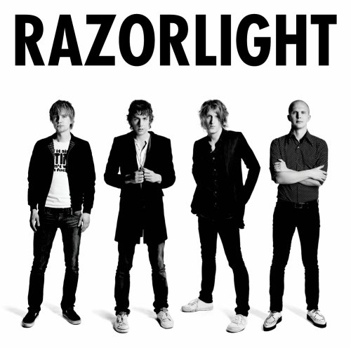
We used the search engine ‘Google’ to search for general information about different music videos, bands, music genres and the like. We used it to find the websites for real artists in the indie genre like Razorlight and Feeder. From these real band websites we were able to look at music videos of the same genre as our own and compare how they conformed (or didn’t conform) to the music video conventions in Goodwin’s music video analysis rules.
Without the internet we probably would not have seen nearly as many examples of different music videos, digipaks and magazine adverts that in turn would have meant that our own products were not as developed and would not be as realistic as they are now.
Alex Rootes
Monday 7 December 2009
Friday 4th December
We decided that we would make it slightly different from other groups so that it provided an informative commentary on our media project but was also not boring to watch.
Tuesday 1 December 2009
Tuesday 1st December
Monday 30 November 2009
Digipak and Magazine Ad Shoots
We did our photos for our digipak and our magazine ad. We thought about our ideas which we had originally planned and thought that if it was on a magazine in an advert then it may confuse people if they had not seen the actual video. Therefore we decided to just do a few photos of just me. This is because it is more relevant to the indie based genre and it would also look good if you were just flicking through a magazine and see it. However we didnt just want to have a plain face on shot so we decided to get an interesting shot with a different background to that you might expect.


Magazine Ad

Today we finished all our ancillary tasks, this was our magazine advert and our digipak. Above is our magazine advert, we are proud with what we achieved and think its a good advert that will stand out if people see it in a magazine.
Tuesday 24 November 2009
Apology
We used a college camera inappropriately in a moment of idiocy and we all feel really sorry about it.
I hope that this post conveys at least some of our shame for our actions.
Monday 23 November 2009
Monday 23rd November
We aim to shoot the following shots:
- John against a wall with a "cool" t-shirt on
- John against a wall with a "normal" t-shirt on
- A desk with "cool" items on (Ipod, phones etc)
- A desk with "uncool" items on (calculator, books etc)
Friday 20 November 2009
Group 22 - Homework
Digipak - Developed Ideas
The front cover of our Digipak will be our main character, John, leaning against a wall, down the centre of him there will be a white line. On one side of the line John will be wearing the "cool" clothes from the music video i.e. Hat, bright t-shirt, jeans. On the other half of the line John will wear the "normal" clothes (grey shirt, glasses etc) so the two images will blend into each other. Above John's head we will put the album and artist's name. Along the bottom we will put the stock symbols such as the record label and we will put a parental guidance symbol as the song contains naughty language.
Along the spine will be the artist's name and the album name.
The back cover will be on a similar theme to the front cover. The background will be an ordinary table again with a split down the middle. Down the centre we will have the song titles. Again, one side will have "cool" items - like sunglasses, ipod etc - and the other side will have "normal" items - like a calculator and textbooks.
Idea 2:
Our second idea is that we make a play on the song title that we chose. The front cover will feature John fully dressed in his "cool" clothes against a background of a wall. As in idea 1 above John's head we will put the album and artist's name. Along the bottom we will put the stock symbols & parental guidance symbol.
The back cover will be the same wall but with only the hat John was wearing in front of it and nothing else. The song list would be on the wall above the hat.
Meeting
We also thought of ideas on where we could do the photos. We originally thought about doing some of the shots around Cambourne. However we had a look around college and we have found a few areas that have the right feel about them and can help to make our pictures look even better. They give the right image to the indie genre and will go well with our other work.
Tuesday 17 November 2009
Photo Shoot
- Stills Camera
- Tripod
- John's costumes
- A wall to use as a backdrop
Magazine Ad
- A full page of a face split between the nerdy character and his cool alter ego.
- Will have the band and track name across the page. Will also show the release date for the track on the bottom of the page.
- Will have a small run-down of features in the digpak
- Some "institutional" information such as the record label along the bottom
- A '15' age rating and parental guidance as the song contains some swearing.
Digipak
- Hologram picture mixing nerd character face with the wannabe, popular face. Depending which way you turn it will depend which picture you see.
- Entry into competition where you can win a chance to live the life of the popular character for a weekend.
- Free invitation to go to the release party of the song where you get to hang out with the band members.
- Picture on the front of the case will be a full body split between the cool character and the nerdy one.
- The back of the case will be the track list in the middle of the page. Either side of the list will be the contrast of each side of his life, with his belongings. The wannabe life will once again be in bright colours, contrasting with the nerdy possessions eg; calculator, glasses etc.
- Some "institutional" information such as the record label and a parental guidance logo as the single contains some swearing.
- Footage of the band playing
Monday 16 November 2009
Homework - John

Homework - Alex

I think this would be a good Digipack/Magazine picture because it is visually interesting. This would make the person looking at it want to know more without any further things added.
The mise-en-scene is in a brightly lit room which is painted in light colours. John is wearing colourful clothes and holding a guitar. This all points towards him seeming happy, upbeat and generally 'cool'. This is the steriotypical successful musician image.
Homework - Marvin

I think this would make a good shot as it clearly shows the artist and his 'i don't care' attitude that goes with the genre. Also the whole mise on scene works well as it has clothes that fit with the genre and a good location.
DVD pack
 Features of this DVD pack consist of;
- Track List
- Artist Fan Club Send Off
- Bonus Tracks
- Rating/Parental Advice
- Information About Band
- Album Name
- Artist Name
- Artist Commentary
Analysis of 'Mansun' Digipak


This Digipak is by the indie band 'Mansun'. The front cover of the digipak is a sort of collage with pictures of the different band members both individually and as a group on a background which is two different shades of yellow and some red. The pictures are the colour of the background.
The back cover features a track list for both the CD and the DVD and includes a list of the extras (entitled "Plus"). The back features several conventions such as the record label, the type of disks included, the running time etc.
On the top and bottom sleeves of the cover is the name of the album and the record labels again.
Inside the case there is a fold out section with the CD on one side and the DVD on the other side.
The cover fits the genre (indie) as it is quite quirky and slightly abstract without being too different. The quirky theme is something repeated in most of the band's album covers in the past.
It is a good digipak as it features:
- live footage of the band playing
- A documentary about the bad
- A montage
- Access to download a previous song demo which cannot be seen normally
Conventions of Magazine Ads and Digipak
- Grab Attention - Reviews, Images
- Advertise; - Band Name, Album Name, Release Date, Where its Available, Reviews of Product
- Label
- Website; - Band Official Site, Myspace, Twitter, Facebook
- Audience
- How is the Artist Represented?
- How Successful is it as an Advert?
Digipak
- Special Edition - Adds Value - Sell at Higher Price
- Track List
- Website
- Institutional Info; - Label Information, Who's Who in the Band
- Extra Features; - Posters, Autographs, Pictures, Live Footage, Interviews, Bonus Tracks, Promo Videos, Rating/Parental Advice
- Artist Name
- Album Name
- Image/Motif of Artist
Magazine Advert/Poster

- Bright abstract letters to grab attention
- Picture and name of artist
- Date of release
- Artists website
- Where the product is being distributed
- Gives details of exclusive gift (4 exclusive postcards)
- Record label in bottom left

WHOOP!
Andrea is watching it through and we are waiting to see what she thinks before we do any final adjustments or, if we are lucky, get to upload it as our final version!
Final Edit
Fingers crossed is all I can add at this point......
Extra Filming
John and Marvin did a good job and we now have plenty of extra footage and lip-syncing that we can add into our video during this lesson (Friday 13th).
Tuesday 10 November 2009
Teacher feedback - Tuesday 10th November
I also phoned Marvin during the lesson today as he was not in. We have decided that me and him will come in early tomorrow morning so that we can film some extra footage as it is a must if we are to get a good mark and improve our project. We now need to decide whether to come in after college on wednesday or thursday to add in the new footage which we are going to get and then edit it in with the parts of the video which we have done already.
Tuesday 10th November
I thought I could use the time to smarten up our blog a little bit and to make it of better quality and make it more presentable as we haven't spent many lessons recently focusing on our blog and sharpening it up.
Monday 9 November 2009
Monday 9th Nov
This has limited what we have been able to achieve in the lesson as we feel we have hit a wall with editing and we need more footage.
Because of this we are going to have to change our plans for the week and hope to be able to book the camera out for Wed/Thurs night to film but need to know if John will be able to film then.
Tuesday 3 November 2009
Plans for filming
Adding some more lip-syncing and filming some more live performance of the main character singing. By having more of these shots we will also be able to get rid of some of the hat filler shots which we have too much of at the moment.
Re-filming the 'fight' scene so that you can see it easier and can see more of what is actually happening in the clip.
Re-filming of the scene in which the main character gets followed by those 2 strangers. We could re film this shot so that there are more people following him as it looks a bit empty as it is, and maybe have a group of girls following so it seems like the main artist is more popular.
Teacher Rough Cut Feedback
Also the scene towards to beginning where the character is being chased appears to be irrelevant...
There definitely needs to be more lip synching and close-ups, remember that the point of a music video is to 'sell' the artist and this can't be achieved if you don't see enough of them.
Currently the hat scenes are the best thing about this video, the rest needs some major work. Are you using your storyboard to guide your editing? I suggest you think about addressing the current lack of continuity as a priority.
Lastly, the ending is out of time as the artist claps before the clapping in the song, that needs sorting out too.
Take a look at this video to get ideas on how to make a professional looking video rather than one that looks like students larking around, use it as a basis to improve your video.
Keep up the good work guys.
Responce to Peer Feedback
We also thought that we might need to do some more lip-syncing and, as many other people agreed, then we think that we are going to work on this aspect of the video.
Peer Feedback
Artist representation - presented really well as the lead singer is the only person featured in the footage apart form extras, a large usage of lip syncing and performance .
Peer Feedback
Lyrics & Visuals:
The quote 'I remember my first beer to' is a good match from the lyrics to the visuals, when the milk changes to a pint of beer.
The lyrics 'you look like you got nothing better to do' link with the visuals as the male actually looks like he has nothing better to do in the way he is just walking around, playing guitar, drinking beer etc
Feedback for music and visuals
The video doesn't contain much lip syncing and could do with a little more but the story is clearly shown.
peer feedback -group21
It is an indie song and they have used instruments and the correct clothing for the genre such as the main artist wears a trilby hat and quite casual clothing and plays an acoustic guitar which adds to the indie effect. They also show the artist having fun which would make it appeal to people.
We have one criticism where their is no band performance for the video which is unusual for a indie/band video genre. There are to many shots with the hat which did not link with the lyrics i.e its not a ski cap.
The camera shots worked with the genre. They were quite quirky and new, like how indie music videos are an example of this is where they change the colouring on the screen.
Tuesday 20 October 2009
Teacher Analysis of our Initial Rough Cut
Editing Progress
Monday 19 October 2009
Digipak and Magazine Ad Ideas
- Hologram picture mixing nerd character face with the wannabe, popular face.
- Entry into competition where you can win a chance to live the life of the popular character for a weekend.
- Free invitation to go to the release party of the song where you get to hang out with the band members.
- Will come in a fold out DVD case.
- Picture on the front of the case will be a full body split between the cool character and the nerdy one.
- The back of the case will be the track list in the middle of the page. Either side of the list will be the contrast of each side of his life, with his belongings. The wannabe life will once again be in bright colours, contrasting with the nerdy possessions eg; calculator, ski hat etc.
- A full page of a face split between the nerdy character and his cool alter ego.
- Will have the band and track name across the page. Will also show the release date for the track on the bottom of the page.
Anton Corbijn - Auteur Presentation
Run This Town - Goodwin Analysis
Friday 16 October 2009
Chris Cunningham - Auteur Slideshow
OH YAY SLIDESHARE - Goodwin Analysis
We finally managed to get onto slideshare this lesson and find our presentations on the goodwins theory. Our task for this presentation was to find a music video that we liked, and then we had to analyse the video using the main points of goodwins theory.
OH NO SLIDESHARE
It will be back after some time" therefore we could not get onto the site and get our auteur presentations onto our blog. So next lesson we will have to try and get onto the site again to get our presentations up.
Tuesday 13 October 2009
Teacher Feedback on Blog
However, your blog needs quite a bit of work. The purpose of the blog is to accurately communicate your idea, your research into music videos, digipaks and magazine ads, and also to communicate the planning you have undertaken before your shoot and your editing.
Your blog needs more content that communicates the influences you have - include more current and/or student music videos which influence you or that you think are particularly effective. You also need to include the Goodwin and Auteur presentations you did individually, make sure you tag these correctly.
Also your storyboard images are not clear in terms of what is happening in each of them, put some text on these posts to contextualise these images.
In addition to this you need more detail on your digipak in terms of the design of it, what will it look like, what will be your primary image?
Look at blog of the week to get some inspiration for an ideal blog.
Your video is looking great but you need ot ensure that your blog and your ancillary tasks are just as strong so that you get the grade you deserve.
Keep up the good work.
Change in ideas
Monday 12 October 2009
Filming
We decided to change the location for our filming as we thought that Cambridge was going to be too busy on a saturday and we would not be able to get the shots we required. Therefore we decided to do the filming in Cambourne and in our houses.


Production Meeting

Today we had our production meeting in the lesson. This was so that we could all get sorted about what was going on with our shoot for our music video tomorrow. We have discussed the time and location of where we will meet for the shoot. We have also thought about what props we will need and what the costumes that we are going to wear. The 'nerd side' is going to wear a ski hat, and old clothes that are too small and dont fit properly. And the 'popular' side of him is going to wear bright and stylish clothes. We also had a look at what the weather forecast was going to be for saturday, the weather man said it was supposed to be an alright day, with it being sunny at times.
Tuesday 6 October 2009
Analysis of The Kooks Album Cover
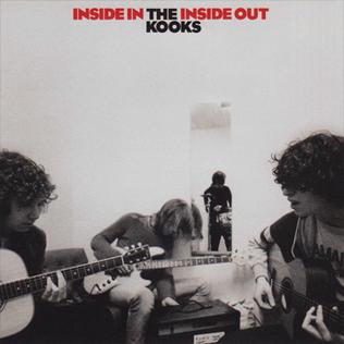
This is the album cover to the kooks album 'inside in inside out'. I selected this album cover because the genre of the music that they do is similar to the song which we have chosen to do. The image which the kooks have chosen to do is a typical cover that you would expect to see for an indie band. The cover shows the whole band together, looking like they might have just come out of a party.
However for our cover we are thinking of doing something separate as our music video is going to be a lot different to the typical conventions of an indie music video of a party and performance etc.
Monday 5 October 2009
Goodwin's Music Video Analysis
- Music videos demonstrate genre characteristics (e.g. stage performance in metal video, dance routine for boy/girl band).
- There is a relationship between lyrics and visuals (either illustrative, amplifying, contradicting).
- There is a relationship between music and visuals (either illustrative, amplifying, contradicting).
- The demands of the record label will include the need for lots of close ups of the artist and the artist may develop motifs which recur across their work (a visual style).
- There is frequently reference to notion of looking (screens within screens, telescopes, etc) and particularly voyeuristic treatment of the female body.
- There is often intertextual reference (to films, tv programmes, other music videos etc).

Friday 2 October 2009
Costumes and Props
School jumper
Black or grey (i.e. drab) trousers
Ski hat
Normal black shoes
Glasses
His other costume is what he sees himself wearing in the shots where he is the famous, well liked person. This outfit consists of:
T-shirt/polo shirt
Jeans
Trainers
Sunglasses(?)
The costumes of the people he is with will reflect his costume i.e. in his normal persona everyone has darker, drably coloured clothes and in his famous persona everyone wears modern 'cool' clothes.
Props that we will require are:
Post (bills and fan mail)
House interior for start and end of the video (things like mirror, tables, chairs etc)
Guitar hero for 'nerd'
Acoustic guitar for 'popular kid'
Music Video Timeline

Ideas for magazine advert and digipak

Digipak:
Our digipak idea is going to include an entry for a competition in which they can potentially win a once in a lifetime opportunity to live the wannabe life of our nerd character.
Another thing which our digipak is going to include is a hologram picture which mixes the faces of the nerd and the fake famous alter ego.
The last extra that is going to be in the Digipak is a special invite to the release party of the song where you get to hang out with the band members.
Magazine Advert:
Our magazine advert is going to include the idea of the main characters face split into the nerd and the famous wannabe life. The nerd side of the face is going to be in dull colours eg; grey. Whereas the alter life is in brighter colours and seems shinier.
Also on the ad we are going to add in the band name and the song name. It is also going to include the release date of the song.